Portfolio
Get in touch at hi@rowan.earth
"AI Search Engines for Science" study
Tribe AI (2024)
Wrote a survey of the current set of platforms for searching academic literature using modern AI techniques.Animal and Plant Health Inspection dashboard
The Data Liberation Project (2024)
The Data Liberation Project obtained a full dataset of the USDA's Animal and Plant Health Inspection Service (APHIS) records using Freedom of Information Act requests, and came to Noomatic for help making it accessible and searchable for journalists. The most interesting part of the dataset is the narrative, which is multiple paragraphs of freeform text explaining why an inspector is giving an animal-housing facility a citation. So we built a dashboard with semantic search by customizing Datasette, an open-source data exploration framework.Health data pipeline
HealthRex, Stanford Department of Medicine (2020 - 2021)
As part of a larger experimental MPC platform, I built a Python package for transforming medical data into a format usable by models. The package lets the researchers declare what data they want from where, and let the data importer worry about how it gets that data. It also ensured that multiple researchers running it in tandem would have consistently formatted data. I deployed it along with the multi-party computing ML framework on a few Google Cloud virtual machines, kicked the tires, and wrote up some documentation for the researchers.Great Firewall Watch: censorship monitoring
Firewall Cafe (2020 - 2021)
Firewall Cafe is a project that began as a gallery installation that allowed people to simultaneously do an image search on Baidu and Google as a way of exploring censorship of the results. All searches and images that are discovered are saved into a dataset. But having a dataset that was collected in a systematic way, tracking terms of interest over time, might prove to be interesting for researchers and journalists looking into censorship. So I build Great Firewall Watch, which runs at a regular interval on a specified set of terms. I prototyped the process in a series of notebooks, and built a portal for researchers to browse its results.Naturalization data + analysis
FiveThirtyEight article, freelance data journalism (2020)
I was a contributing researcher to an article that appeared in FiveThirtyEight on COVID's effects on naturalized citizen voting, and published the data I collected as a GitHub repository. I created the dataset itself with a series of Jupyter notebooks, outputting to Excel for easier analysis. We also looked at what, if anything, we could confidently say about how the closures of naturalization offices (and the consequent prevention of immigrants becoming US citizens) might plausibly affect the outcome of elections in states and districts. But we came to realize that we couldn't say anything conclusive given the data we had.Theater recommendation systems
Thespie (2019 - 2020)
We wanted to sort shows on Thespie by how popular they were, based on how much they were being clicked on. So I built a recommendation system on an AWS stack, with a Lambda being invoked daily to aggregate the user analytics per show and cache the results in the API's database. I also build a similarity ranking system, which we used to recommend shows similar to the one the user is browsing. This all happened as a daily job run by Django, which computed a cosine similarity matrix based on genre tags. Thespie has hundreds of these genre tags, which meant that the system could recommend fairly specific types of shows.Mapping the metabolome
Rheos Medicines (2018)
Tests on the human metabolome create lots of data about tens of thousands of metabolites, which means we want to visualize it somehow. Rheos Rx approached me to design and build a version of ReconMap, which they could use to visualize information from metabolomics tests they were performing.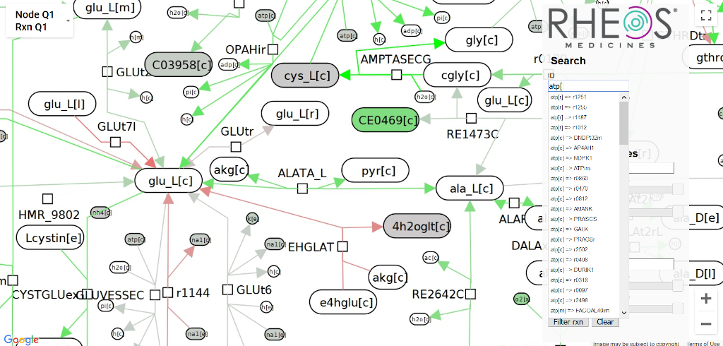
Using the search box to find metabolites in the finished visualization.
The metabolome was represented as a massive, static graph layout with ~20k nodes and ~20k edges. I implemented the project as a Python package which pipelines a GraphML and CSV file (metabolome layout and experimental data, respectively) into image tiles at 7 zoom scales for the front end and a metadata file with node positions. The Python package colors the nodes and edges of the metabolome a color based on quartiles in the data. The front end is a Google Maps client which loads the images as tilesets, and lets users search based on a reactant's name or highlight based on type. I prototyped both DOM-based and canvas-based front ends, but Google Maps was by far the fastest (and likely easiest) approach since it had already solved the exact problem we had.Drug discovery dashboard
NuMedii (2017 - 2018)
Scientists at NuMedii needed a way to explore relationships between drugs, genes, and diseases at a high level, informed by NuMedii's drug enrichment analysis software. Testing drugs for treating diseases is expensive and time consuming, and the potential exists for existing drugs that have already undergone some testing to be repurposed for treating another disease.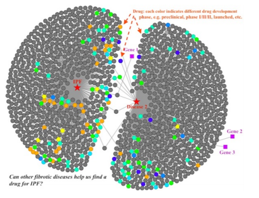
Exploring the drugs that affect the pathways of both Idiopathic Pulmonary Fibrosis and Disease 2.
The dashboard was implemented as an Express + D3 front end, making queries to get scientific data from a back end database. I worked on the front end, optimizing load times and add/remove calls to the graph network, building new node types based on other enrichment analysis data, and improving the layout engine.Evergreens of Washington map
personal project (2016)
This map project is a love letter both to D3's wonderful mapping tools and the biodiversity in the Pacific Northwest. Read the longer making-of here, but in short, I built a dashboard that uses tree range maps to indicate the ecosystems where various evergreen species grow in Washington state.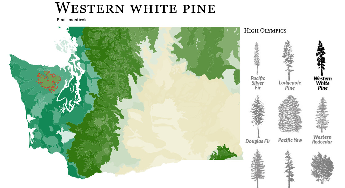
Nanocrafter, a synthetic biology game
Center for Game Science, University of Washington (2012 - 2015)
I was part of a small team of research engineers at the Center for Game Science that built Nanocrafter, a game which challenged players to build machines out of RNA to solve puzzles which was funded by DARPA and the National Science Foundation. I also spearheaded the design of its peer scoring, which later won the game an award at the Serious Games Showcase and Challenge. Sadly, the game was shut down a few years ago, but is hosted by the Internet Archive.